There are 2 ways to add a mobile header:
- via header Layouts
- in the Customizer
Creating a Mobile Header in Layouts
Layouts is a preferred way of creating a mobile header since it gives you flexibility and control over your elements. Creating a mobile header is similar to creating a standard header, except there are several features you should know about in order to use Layouts more efficiently.
Layouts Menu Shortcode
The Layouts: Menu shortcode includes an option to enable the mobile menu. Use it to transform your regular menu into a mobile menu on smaller resolutions automatically.

Hide Layout shortcodes on specific devices
In the settings of each Layout shortcode, you can find an option to hide it on a specific resolution.

You can also show/hide an entire row on a specific resolution. In the Row settings, go to the Custom Layouts tab.
Here’s the full list of available resolutions:
- Desktop – larger than 1680px
- Notebook – from 1168px to 1679px
- Tablet – from 768px to 1167px
- Mobile – lesser than 767px
In this way, you can create independent mobile headers by disabling certain rows on desktop and notebook devices, and enabling them on mobiles and tablets.
Adding a Mobile Header in the Customizer
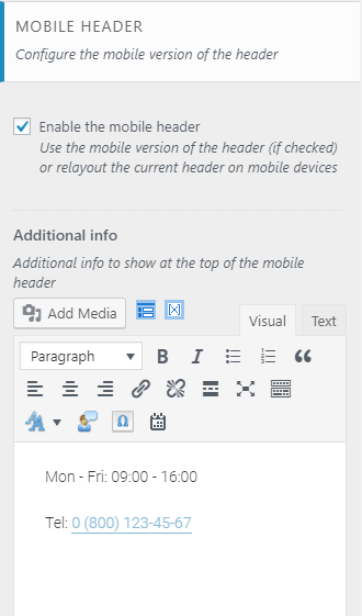
Instead of Layouts, you can use the default mobile header in the Customizer. Enable it in the Mobile Header section in Appearance > Customize > Header.
Please note! The mobile header is visible only if you choose default header style in Appearance > Customize > Header.

This type of a mobile header lets you show/hide such elements as logo, search form, login link, and shopping cart. You can also use the Additional Info section, a text block where you can add information about your business, such as telephone number, open hours, etc.